New release Study Guide 2.28

Improvements
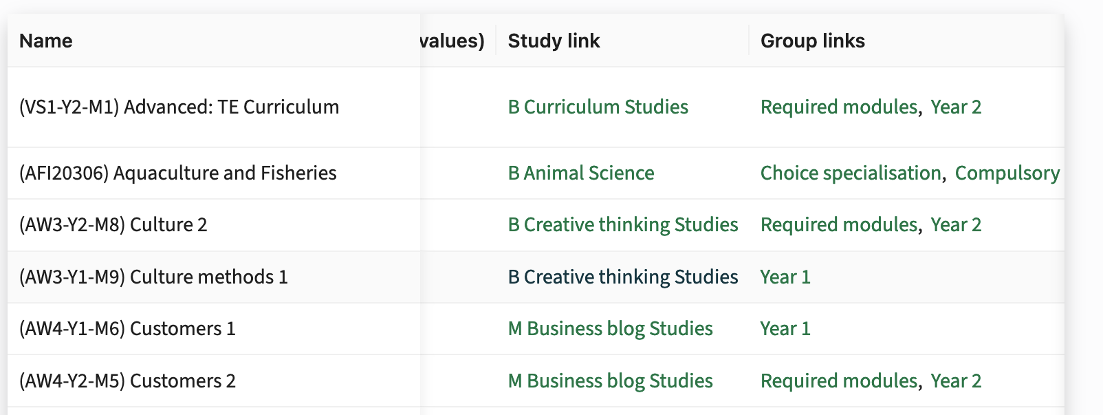
Fully Configurable Overview Pages with Widgets - SG-275, SG-310
The always-visible sections in the overview pages for entities like studies, qualifications, faculties, groups, and modules are now fully customizable using a new Primary widget type. Previously, these sections displayed fixed information, but with this update, administrators can optionally configure both the title and main information using widget fields.
To configure:
- Create a new widget of type Primary.
- Add this widget to the main tab (a tab without parent tabs) used for the overview.
- The Primary widget can be configured with widget fields, all widget field types are supported.
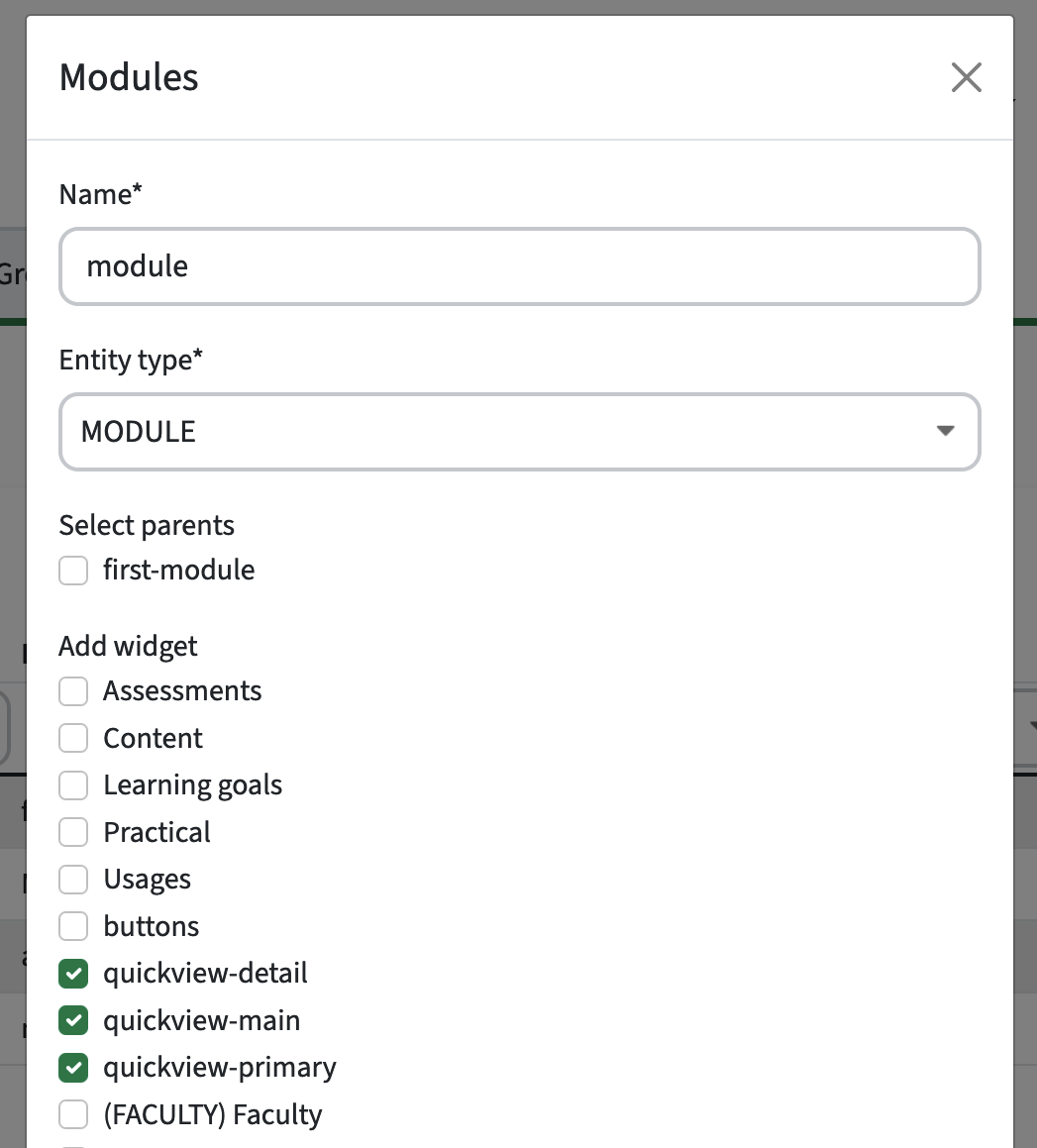
The widget field with the lowest sequence number is shown in bold in the overview, with other fields displayed below it. When multiple values are present, they will be separated by commas.
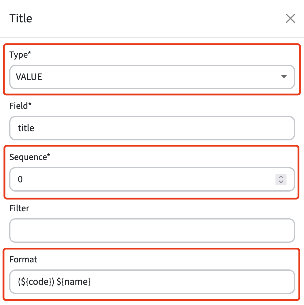
For instance, you can display a title or name in bold using a widget field of type VALUE, where a format like (${code}) ${name} can be configured. Currently, only the ${code} and ${name} keys are supported for this purpose.
Additional configuration options include:
- Customizing proper labels.
- Hiding empty values.
- Adding tooltips.
Admins can also customize views differently for various entities (e.g., studies, groups, faculties) and refine the study guide with this new flexibility. As a tab can have filters, it becomes possible to configure different fields for each distinct overview. For example, the tab for minor programs might show a faculty and link field, whereas the master program tab shows an organization instead.
For backward compatibility, if no Primary widget is configured, the system will revert to the original title and field layout. However, we highly recommend setting this configuration up, as the hardcoded values might get removed in a future update.
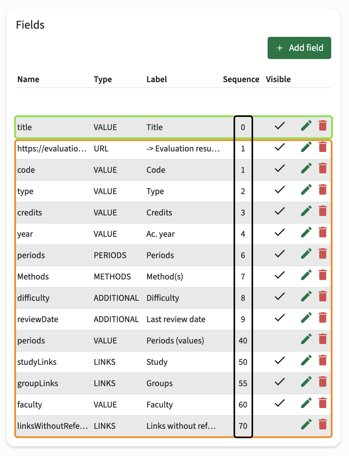
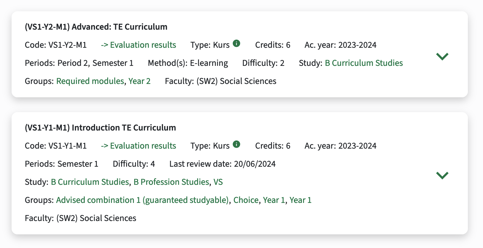
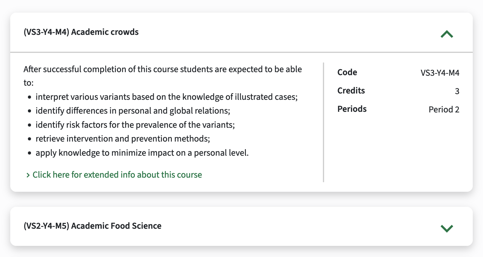
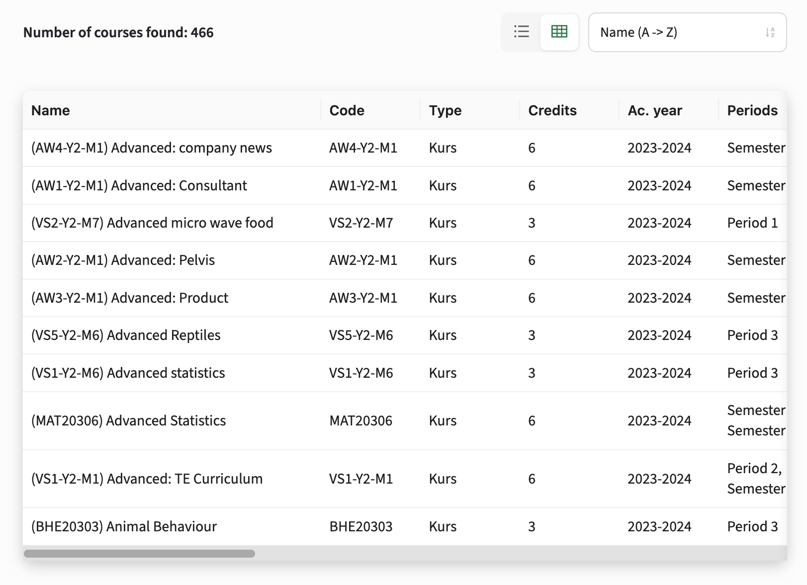
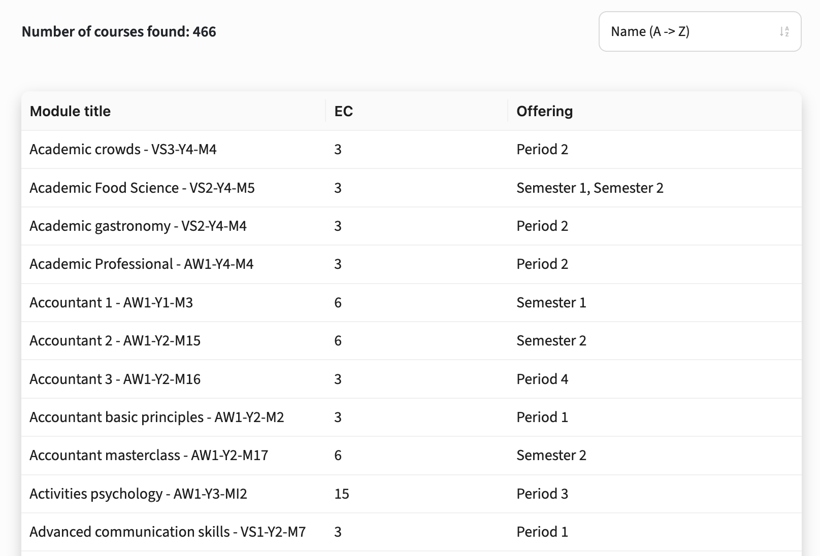
Table Mode for Product Overview with Primary Widgets Columns - SG-272
This update also introduces a condensed table mode for product overviews, allowing admins to display the new Primary widget fields in a table format. This brings more structure and a user-friendly layout to product data, while providing admins with significant flexibility in how information is presented.
Two Display Modes
Admins can configure available modes per tab using the new modes option:
- Existing tabs: Default to the existing list mode to ensure no breaking changes.
- New tabs: Default to both list and table modes (list,table), allowing users to switch between the two.
- The order in which modes are configured determines the default display:
- table,list: Shows both table and list modes, with the table displayed first.
- list,table: Shows both table and list modes, but defaults to the list view first.
- list: Only shows the paneled list mode
- table: Only shows the condensed table mode
- The mode selector is only shown when multiple modes are enabled.
- If no modes are configured (e.g. for new tabs), both list and table modes are active, with list mode displayed by default.
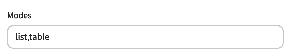
Table Mode Features:
- Primary Widget Fields: Each widget field is shown as a column, showing the labels as headers. The Table mode always requires configuration through widgets, unlike the List which has a fallback to fixed fields.
- Widget Field Types: All field types are supported, horizontal scrolling is available when necessary (with the first column fixed on tablet and desktop).
- Clickable Rows: Clicking on a row navigates to the product, while URL and LINKS fields open their links instead.
- Increased Page Sizes: If the table is the default mode, the page size(s) increase.
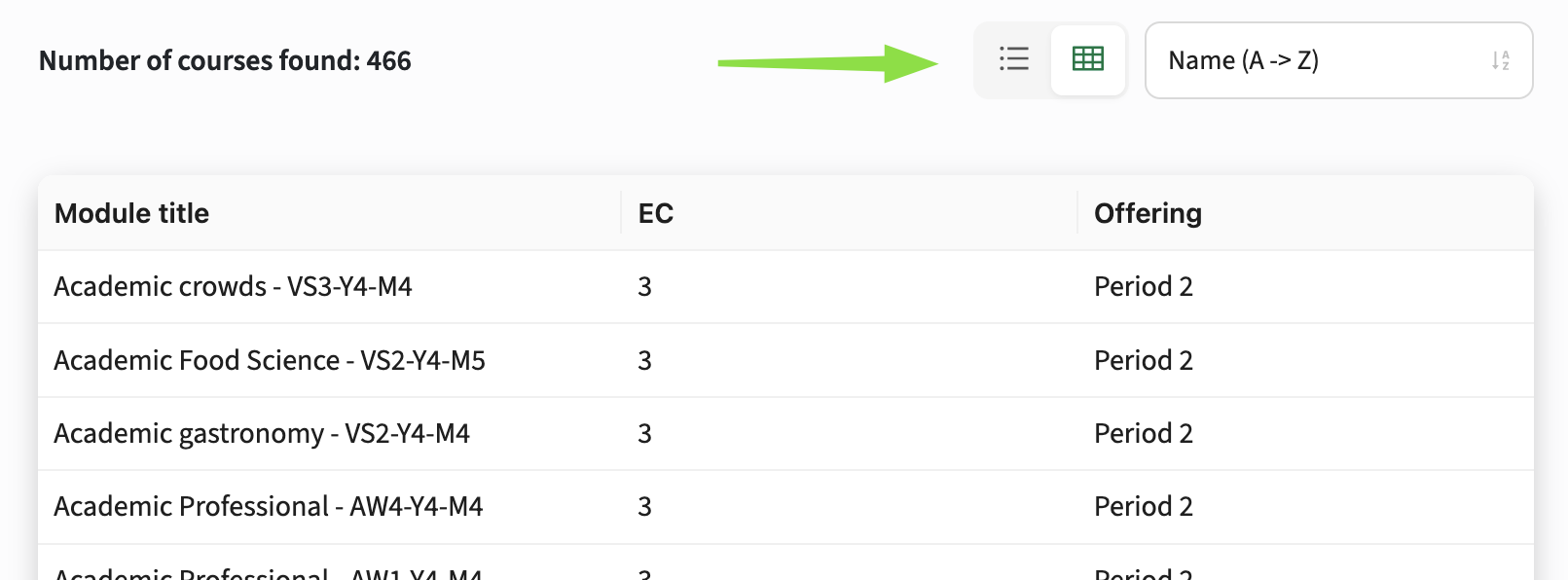
This feature allows for highly tailored views, like a simple table for faculties with a few key fields, or an extensive list for modules showing multiple widget fields.
We recommend enabling both list and table modes (list,table) to offer users flexibility. Table mode is especially useful for those who prefer structured data or need easier navigation, and may improve accessibility, particularly for users using a screen reader.
Improved Sort Selector - SG-272
The sort selector has been redesigned to look more like a dropdown, with added icons for each active option, enhancing clarity, interactivity and consistency with the new mode switcher.

Fixes
No Modules Shown in Structure Groups Until Mode Switch - SG-306 - >2.27.1
Resolved an issue where no modules were displayed in structure groups when opened in the default table mode. Modules are now correctly shown without needing to switch to list mode and back to table mode manually.
Slow Loading of Tabs - SG-275
Tab loading performance has been significantly improved, making the interface feel faster and more responsive. Content now loads smoothly, reducing layout shifts for a more stable user experience.
Security
No OWASP vulnerabilities (see the central database of vulnerabilities) were detected in this release.
For more guidance on configuration and setup of Study Guide, use the relevant Study Guide manual.


Customer unique training

