New release Study guide 2.12
New Features & Improvements
CONFIGURATION, USABILITY - Introduced support for filter on boolean values - SG-53
A new option is added offering support for filtering on attributes defined as a Boolean value, by adding a new filter of type Boolean.
The filter is shown as a checkbox that if checked will search for all objects with a Boolean value of true.
CONFIGURATION, USABILITY - Introduced a new widget field supporting subjects (skills and learning outcomes) - SG-55
A new widget field has been added to support visualisation of the subjects defined in TE Curriculum. The visualisation will transform the list of subjects to a bullet list.
To configure the widget:
- Select the Content widget to be modified
- Select Add field to add the new Subject type information
- set the Type to SUBJECTS.
- set the Name as the unique internal name/code of the widget
- define the Sequence, that is used as the (relative) order it will be shown on the page
- define the Reference type, that will be used to only display subjects belonging to a specific type, e.g. skills or learning goals.
- define the Label, that will be uses as the header / title of the widget in the study guide
- define a Tooltip, that will be uses as the introduction text above the bullet list

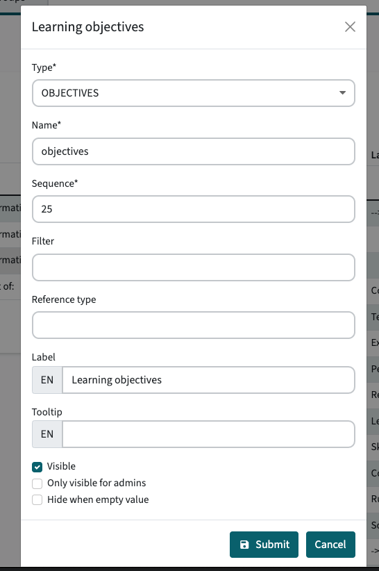
CONFIGURATION, USABILITY - Introduced a new widget field supporting objectives (learning goals) - SG-61
A new widget field has been added to support visualisation of the objectives defined in TE Curriculum. The visualisation will transform the list of subjects to a bullet list. The configuration offers support for adding an introduction text prior to the shown bullet list. This allows for adding a text like 'As a student you will learn:' to introduce the bullet list.
To configure the widget:
- Select the Content widget to be modified
- Select Add field to add the new Subject type information
- set the Type to OJBECTIVES.
- set the Name as the unique internal name/code of the widget
- define the Sequence, that is used as the (relative) order it will be shown on the page
- define the Label, that will be uses as the header / title of the widget in the study guide
- define a Tooltip, that will be uses as the introduction text above the bullet list
CONFIGURATION, USABILITY - Introduced a new widget field supporting appraisals - SG-58
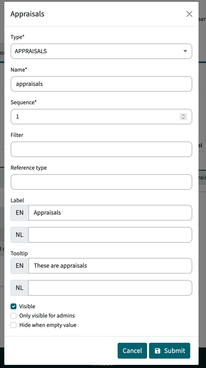
A new widget field has been added to support visualisation of the appraisals defined in TE Curriculum. The visualisation will show the defined appraisal information.
To configure the widget:
- Select the Content widget to be modified
- Select Add field to add the new Appraisal type information
- set the Type to APPRAISALS.
- set the Name as the unique internal name/code of the widget
- define the Sequence, that is used as the (relative) order it will be shown on the page
- define the Reference type, that will be used to only display subjects belonging to a specific type, e.g. skills or learning goals.
- define the Label, that will be uses as the header / title of the widget in the study guide
- define a Tooltip, that will be uses as the introduction text above the appraisal information
INFO: In order to function properly the METHOD_TYPE reference table MUST be imported. Just check if the information is not shown / shown incorrectly.
CONFIGURATION, USABILITY - Introduced a new widget field to define textual content - SG-55
A new widget field has been added to support visualisation of the textual content and define the order in the respective widget it is added.
To configure the widget:
- Select the Content widget to be modified
- Select Add field to add the new textual (Description) information
- set the Type to DESCRIPTION.
- set the Name to identify the Description to be shown
- define the Sequence, that is used as the (relative) order it will be shown on the page
- define the Label, that will be uses as the header / title of the widget in the study guide
CONFIGURATION, USABILITY - Introduced extended widget configuration support for the content/ left part - SG-66
The setup of the study guide consists of two parts, the right side with the widgets showing the information for the object and the left side displaying the textual information. The information side supported configuration of widgets and the respective information to be shown in the widget. The content side only supported the display of the textual information in an order specified by the administrator.
The two earlier mentioned types can be added to the widget configuration as shown in the image below. In this case a configuration setup of the content section of a module is shown. The subjects and objectives are added as fields in the widget configuration and located between the textual information. The change also enables to manage the order and freely determine where the new information is shown in the display sequence.
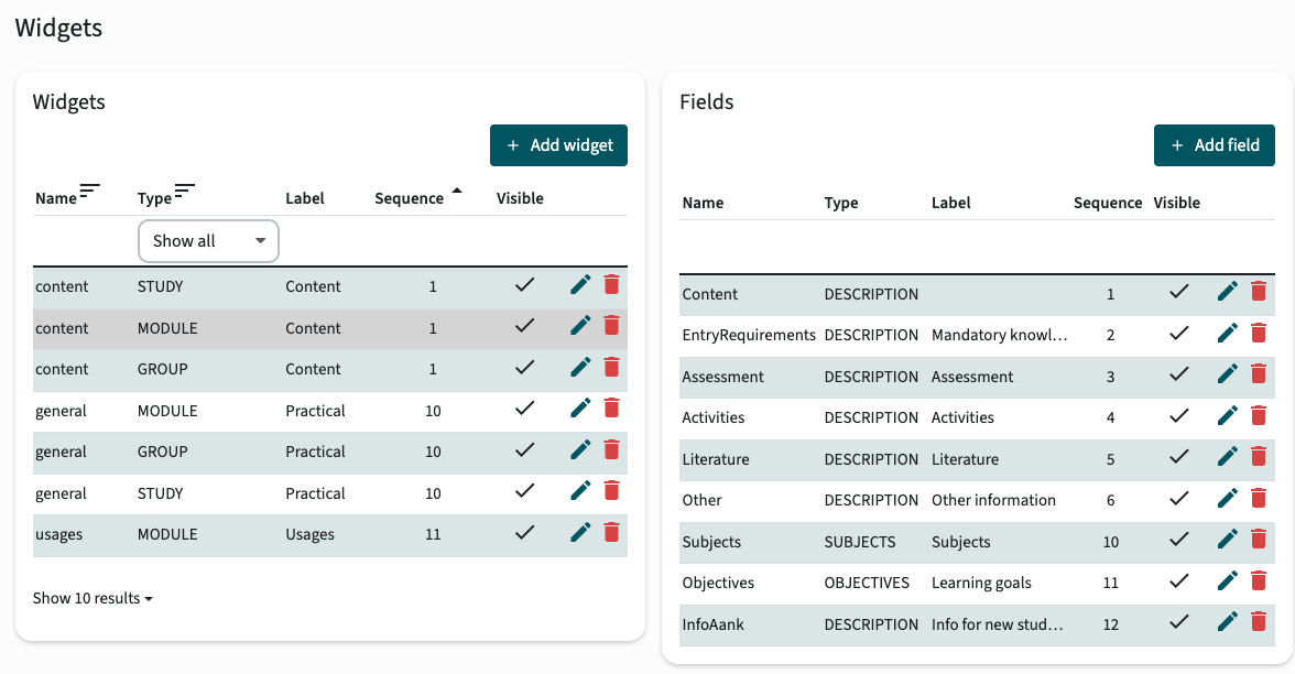
A new option is introduced to specify the 'location' of a widget, enabling to position widgets both in the content side and the information side. The visualisation of the widgets will adjust based on the location, since the width of the two areas is different.
CONFIGURATION ACTION REQUIRED
The release will completely modify the configuration of the content area. The content area must at least be configured with the relevant Description fields to display these in the same way and order as prior to this release. See the above screenshot that shows the configuration of the Content widget including the usage of the new Description fields.
After the release the import MUST be run for the study guide to function properly.
The image below shows the configuration of a new widget name Learning goals. This widget is configured to show the objectives (learning goals) of the module.
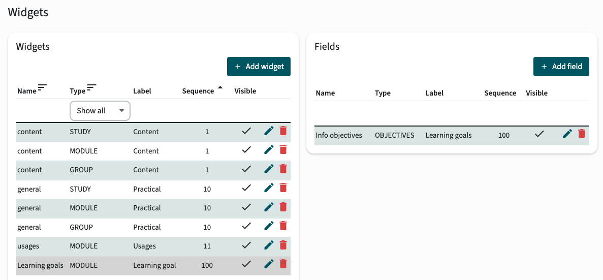
In this case the information should be shown in the information side of the study guide and is therefor configured to be shown at the right position.

CONFIGURATION, USABILITY - Enable visualisation of Offering custom-fields - SG-52
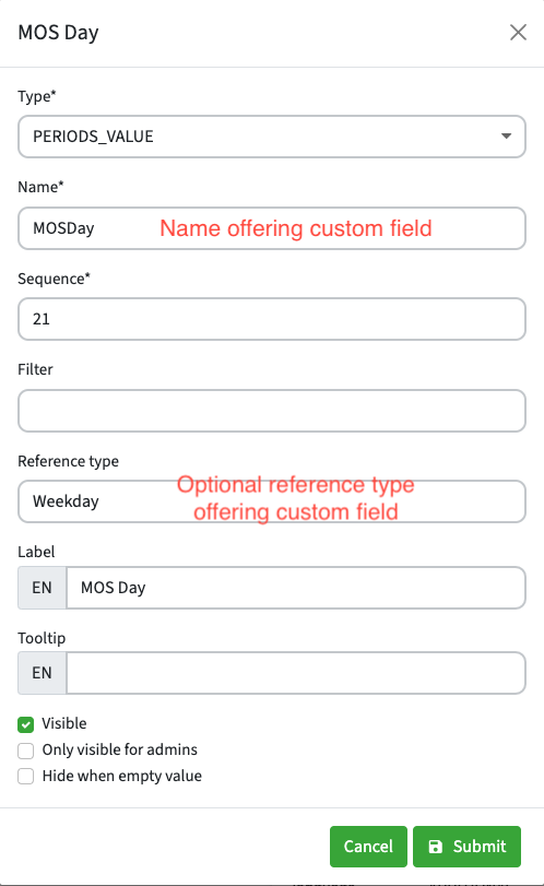
A new widget field has been added to support visualisation of Offering custom-fields defined in TE Curriculum.
The name in the periods field is used to display the offering custom value. The example below shows the configuration of the periods field to display MOSDay:
The MOS day will be displayed on a new line below the period. In this case all periods have MOS day Monday.
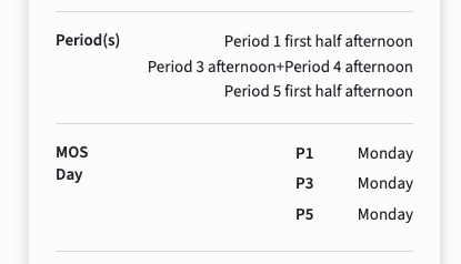
The widget field can be hidden by selecting “Hide when empty value” in the widget field configuration.
Bug fixes
BUG FIX - Longer tab names should not be displayed over multiple lines - SG-41
In case a long tab name is defined this would be split over multiple lines, even if there was enough space available to grow the 'tab' button. This is fixed and the tab name is correctly displayed on one line and will grow the tab button size automatically.
BUG FIX, USABILITY - Always display a value by using the fall-back language - SG-64
In a multi-lingual setup in case a value (data)has no translation, an empty line was shown. This is modified so for display purposes TE Study guide will display the value from the non-selected language in case no data in the selected language is defined.
BUG FIX, USABILITY - Text was not always correctly faded out - SG-63
In case a textual description is too long, the 'show more' button will be shown, to allow the user to show all information. In case a textual description did just fit and didn't need the show more, the last line was faded out similar to the situation where the 'show more' would be shown. The user could have the impression that there was more text and the button was missing, and due to the fading could barely read the last line. This has been solved, so the fade out will not be shown for text that just fit.
Customer unique training


