Study Guide: configuration of the user experience
The Study Guide is highly configurable by the Administrator using the configuration options. This administrator manual focusses on the configuration of the user experience like filters, tabs, information to be shown, etc.

Configure filters (left side bar)
Objects can be filtered via filters. The administrator can add or modify the (visual) behaviour of filters for each of the objects.
The image below shows two defined filters.

Go to the Administrator -> Filters to open the filter management screen.

The configuration screen shows the different options that can be used for filtering the different Study guide entity types(faculty, qualification, study, module-group and module).
Use the select box to only select the defined filters for a specific educational object type.
Click on Edit to add a new filter or configure a new filter.
Standard filters
The default configuration options are available for the standard filters. The options supported are:
- Name: the technical Name of the field as it is defined in Curriculum
- Entity type: the educational object type the filter is defined for (study, module, ...)
- Value type: the source / type of data that will be used for filtering in this filter. Supported types are:
- Date: used to define a filter on a date with a specific start and end date selector
- Number: used to define a filter for a numeric value
- Product: used to define a filter for another education object, e.g. faculties on module. The file will show the list of faculties.
- Reference: used to define a filter that is based on a reference list imported from Curriculum
- Boolean: used to define a filter for a boolean value
- Sub type (not visible): used for Reference type filter to define the reference list to use.
- Label: the text shown to the users above the filter options
- Tooltip: configuration of an optional tooltip shown next to the filter name
- Sequence: the order in which the filter is presented to the user
- Values: the supported/offered values for filtering.
Default the values are automatically generated based on the different values for the element in the data set (e.g. all different credit values for the studies). - Display type: defines the used display option for the filter
- Show all filters is default selected, that will show all defined filter options
- Show more/less toggle will default show the configured Max. filters displayed amount of filter options. This offers the option to reduce the shown values and have more overview of all other defined filters. Especially in case a large(r) list of filter options is available, the underlying filters may be pushed out of the direct visual part of the screen.
- Show popup with all filters is intended for filters that have a large amount of filter options. The options will be opened in a popup that provides a search to find and select the desired filter option(s)
- Max. filtered displayed: option to limit the number of filter options to show. Is only applicable for the Show more/less and Show popup option.
- Exact: Indicator if in case of a Values the options are shown as checkboxes or a slider bar.
- Visible: Indicator if the filter should be shown or is hidden.

In case a filter uses a reference, like the imported difficulty, the values provided in the reference list are used by default. The values can be overwritten by adding 'own' values.
This option can also be used to limit the offered filter options, by only allowing a limited set of difficulties.
Configure tabs
The configure tabs option is used to define the tabs used for navigating the different education elements by the end user in the study guide.
Tabs can be configured at:
- the main level, providing direct access to specific educational objects. The main tabs can be based on a filter, e.g.studyId in ('BA', 'MA')
- the detail page, providing a toggle option between different types of content, e.g. texts and structure for study, or texts, learning goals and assessment scheme on module.
Below there are three different options of tab configurations


Go to the Administrator -> Tabs to open the tabs management screen.
The screen will open an overview of the defined tabs.
Indicators are used to define if the tab is a sub-tab (located on a detail page), has widgets assigned and the optional defined filter.

Use the select box for Entity type to switch between the different types (study, module group, module or show all).
Click on Add to add a tab or click on the pencil to modify an existing tab configuration. The example below shows the configuration for the bachelor tab.
Options:
- Name: name (technical identification) for the tab setting
- Entity type: the education element (study, module group, module) the tab is configured for
- Select parents: For sub-tabs the parent must be defined, or in other words the page that will provide the different tabs.
- Add widget: Select the widgets that should be shown on this page. Check for widget location and widget configuration the next sections in this manual.
- Label: the text shown in the tab to the user.
In case the system is configured ‘multi-lingual’, the label can be set for each language - Sequence: the order of the tab in the header bar
- Filter: the filter to be used by the tab
Filter options supported are =, !=, in, e.g. type in (BA, MA). The used filter_name and filter_ value should both exist and be similar to the Name / Code value defined in Curriculum.

The Bachelor main tab uses a filter to only show studies of a specific type (BA).

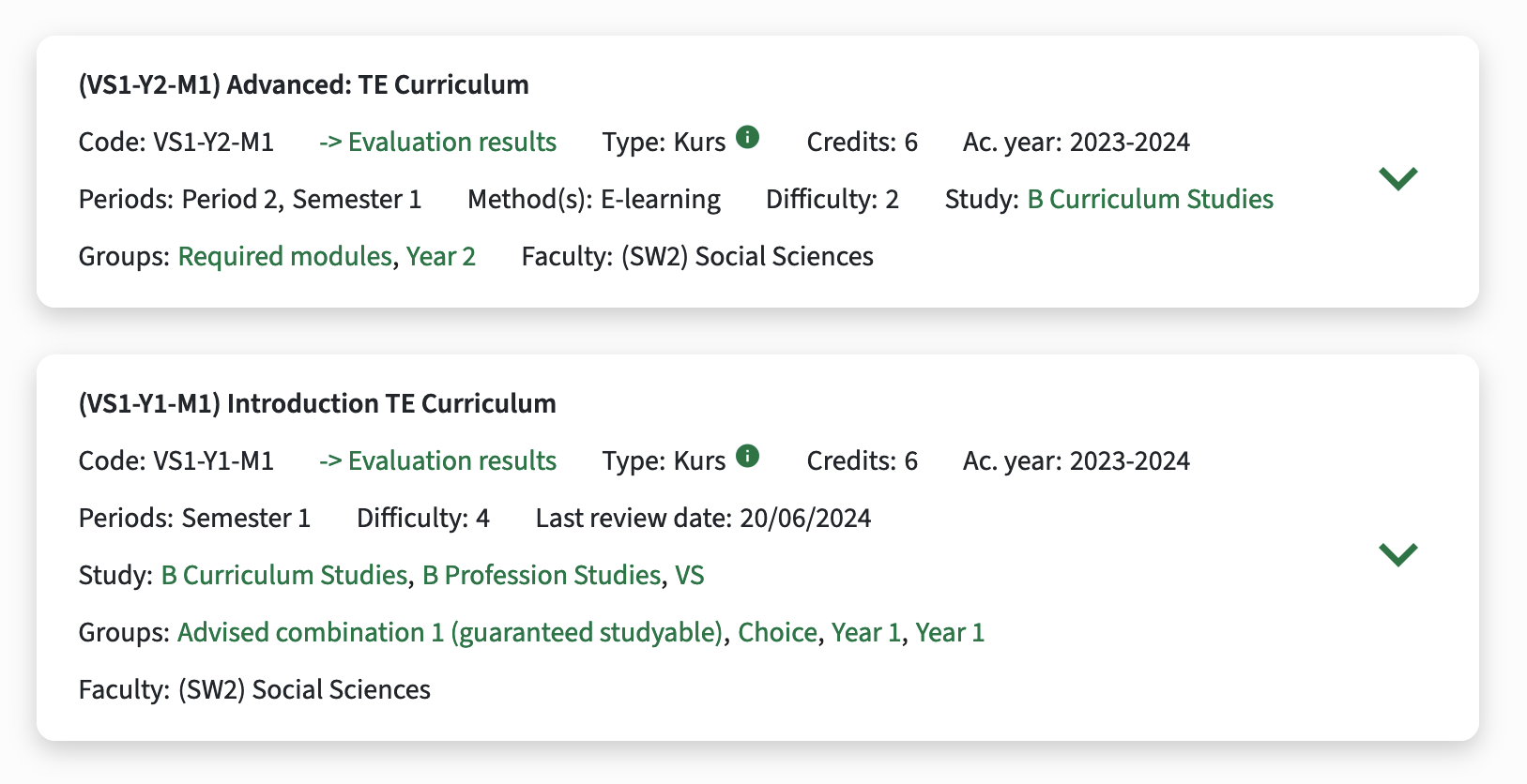
Configure search result
The search result is fully configurable, where two sections are defined and can be styled independent.
On the left side is the Container area, where the first available description is shown. A configuration option is available to show the Title of the description, or just only the text (as is the current situation).
On the right side is the Sidebar are, where the relevant attributes are shown.
The details are still accessible by clicking on the link to show more details.
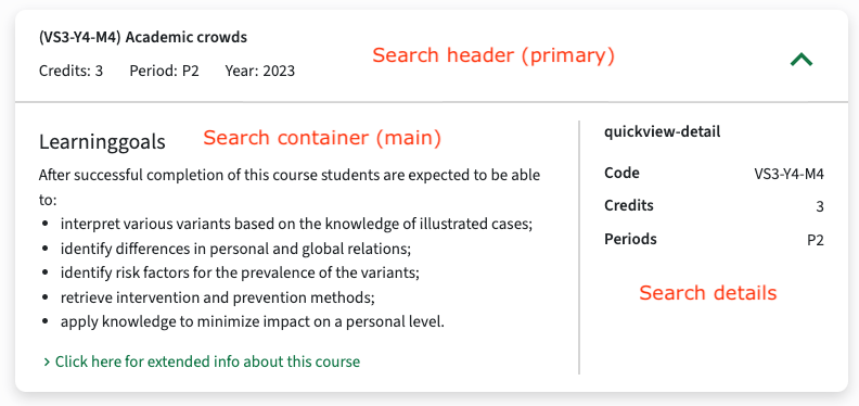
The first step to configure the search result is to define three separate widgets, one for the search header, one for the container, and one for the sidebar (details). In the example below the second two are shown and named quickview-main for the Container and quickview-detail for the Sidebar.
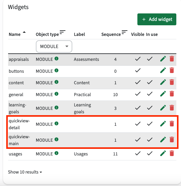
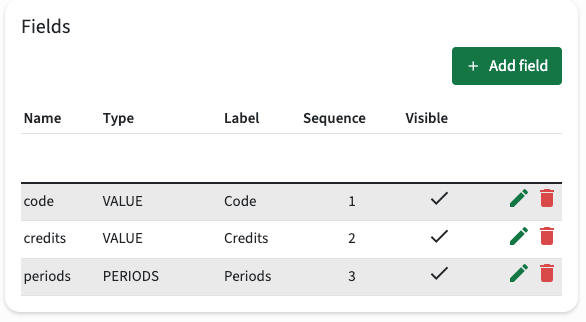
Next step is to configure the quickview-detail.
Just click the pencil (Edit) of the quickview-detail and add the fields to be shown.
The example has added the code, credits and periods field.
The next step is to configure the quickview-primary (header).
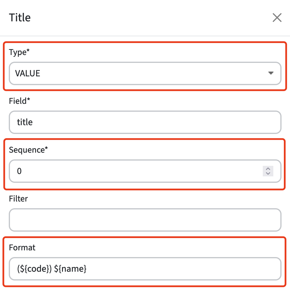
Define the fields to be shown including the sequence,
The widget field with the lowest sequence number is shown as title bold in the overview, with other fields displayed below it. When multiple values are present, they will be separated by commas.
For instance, you can display a title or name in bold using a widget field of type VALUE, where a format like (${code}) ${name} can be configured.
Currently, only the ${code} and ${name} keys are supported for this purpose.
The display format configuration option is provide for each object and supports ${code} and ${name} as replaceable attributes and can be constructed using standard characters, e.g. Intro to curriculum (VS1) -> {name} ({code})
Additional configuration options include:
- Customizing proper labels.
- Hiding empty values.
- Adding tooltips.
Admins can also customize views differently for various entities (e.g., studies, groups, faculties) and refine the study guide with this new flexibility. As a tab can have filters, it becomes possible to configure different fields for each distinct overview. For example, the tab for minor programs might show a faculty and link field, whereas the master program tab shows an organization instead.
If no Primary widget is configured, the system will revert to a preconfigured title and field layout. However, we highly recommend setting this configuration up, as the hardcoded values might get removed in a future update.
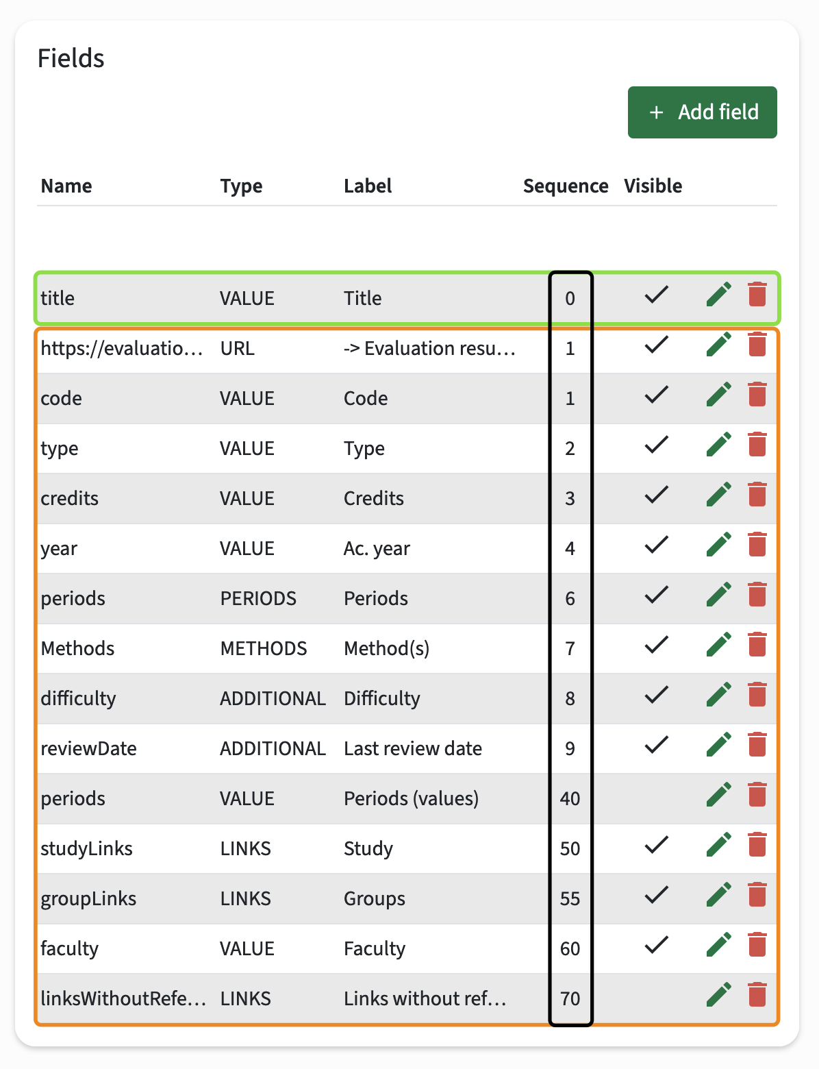
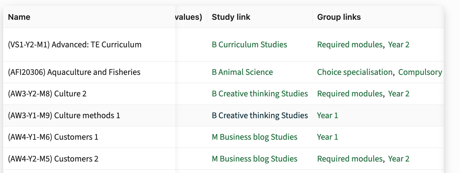
The search result header base on the above list of fields is 'pretty crowded', but provides a good overview of setting the title and what happens in case a huge number of fields are selected for the search result header. Depending on the field, a direct link to a 'related object' is provided.
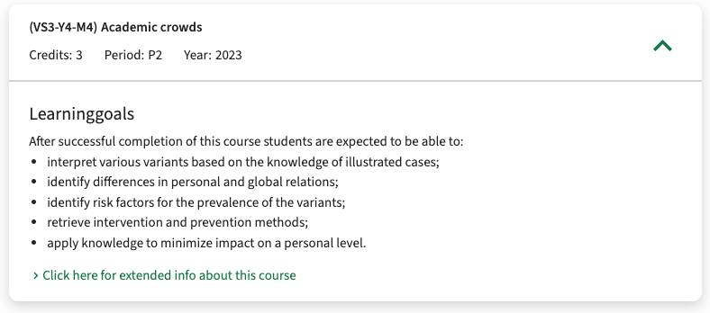
The next step is to configure the quickview-main.
Define the description to be shown including the sequence they will be evaluated on existence of data.
The example belows will by default show Learning Goals (sequence 1), and have a fall-back to show EntryRequirements (sequence 2).
Don't forget to set the 'hide when empty' flag on the description to prevent from showing the Title.
The next step is to configure the module search result widget by assigning the two defined widgets.
Configuration also allows to only define for instance the Container (quickview-main), so only the descriptive text is shown and no additional fields are shown in the Container area.
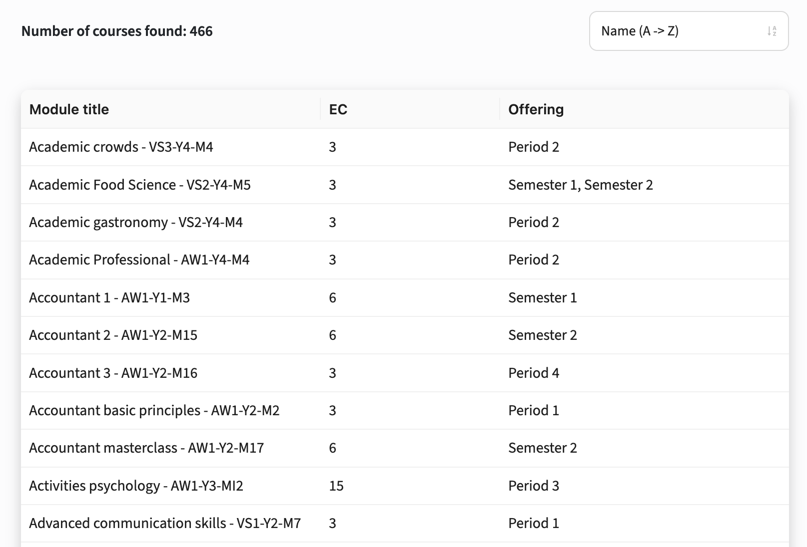
Search result tab or list view
This search result provides two options to be shown:
- tile-oriented table result
- condensed list result
The tile-oriented (table) result is shown in the examples in this section (above).
The condensed list mode for product overviews is less verbose and might in some cases offer more structure and a user-friendly layout to the search result data. By supporting both option it provides admins with significant flexibility in how information is presented.
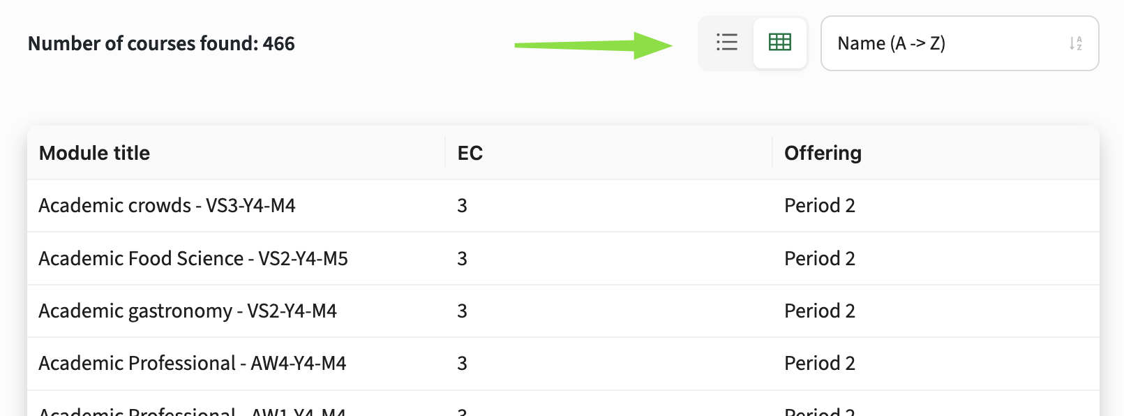
Two Display Modes
Admins can configure available modes per tab using the new modes option:
- Existing tabs: Default to the existing list mode to ensure no breaking changes.
- New tabs: Default to both list and table modes (list,table), allowing users to switch between the two.
- The order in which modes are configured determines the default display:
- table,list: Shows both table and list modes, with the table displayed first.
- list,table: Shows both table and list modes, but defaults to the list view first.
- list: Only shows the condensed list mode
- table: Only shows the panel table mode
- The mode selector is only shown when multiple modes are enabled.
- If no modes are configured (e.g. for new tabs), both list and table modes are active, with list mode displayed by default.
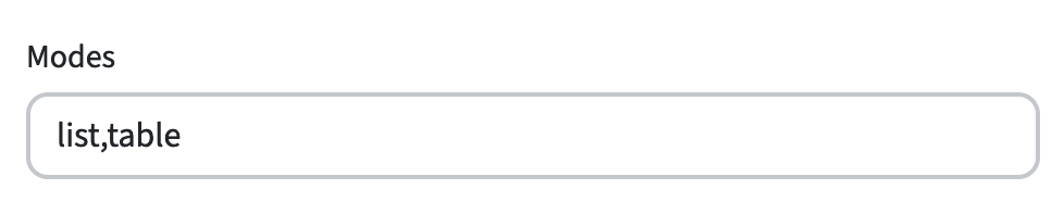
Table Mode Features:
- Primary Widget Fields: Each widget field is shown as a column, showing the labels as headers. The Table mode always requires configuration through widgets, unlike the List which has a fallback to fixed fields.
- Widget Field Types: All field types are supported, horizontal scrolling is available when necessary (with the first column fixed on tablet and desktop).
- Clickable Rows: Clicking on a row navigates to the product, while URL and LINKS fields open their links instead.
- Increased Page Sizes: If the table is the default mode, the page size(s) increase.
Based on the configuration an option is offered two switch between the different display modes.
This feature allows for highly tailored views, like a simple table for faculties with a few key fields, or an extensive list for modules showing multiple widget fields.
We recommend enabling both list and table modes (list,table) to offer users flexibility. Table mode is especially useful for those who prefer structured data or need easier navigation, and may improve accessibility, particularly for users using a screen reader.
Layout of the detail page
The detail page of an education object (Faculty, Qualification, Study, Module-group, Module) is structured in a generic layout with designated sections.
Each section can be filled with widgets. A widget allows configuration of information to be shown in a specific format.
The supported sections are:
- Sidebar: The area at the right to provide both information and contextual information about the shown education object.
- Container: The area that is used to show the descriptive study guide texts. It will shown a button in case a structure section is defined, enabling switching between the different views.
- (Program) Structure: The area that is used to show the structural layout of a program of module-group. Having both a Container and Structure will lead to a button to switch between the views.
- Appraisals: The area that is designated to enable visualisation of the assessment scheme (appraisal) widget.
- Buttons: The area at the top that allows configuring links to other systems, displayed as buttons.

Configure the general widget (practical information)
To configure the information to be shown as practical information, a widget with the name general must be defined.
Go to the Administrator -> Widgets to open the Widget management screen.
An overview of already defined (or pre-configured) widgets is shown.

On the left hand the widgets can be managed.
Click on the select box underneath Type to filter the configured widgets for a specific educational object type (faculty, qualification, study, module group, module).
On the right hand the information elements configured for the widget are listed.
Add or modify a Widget configuration
Click on the Add widget button to add or on the pencil to modify an existing widget.
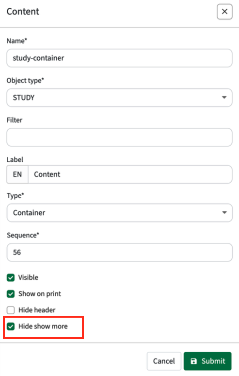
The example below shows the configuration for a widget with practical information in the module details.
Options supported are:
- Name: the technical name, used for identification in the study guide
- Object type: the type (faculty, qualification, study, module group, module) the widget is for
- Filter: Optional filter configuration to only show this widget in case the configuration is met, e.g. type = MOOC to only show this widget if the module type = MOOC.
- Label: the (multi-lingual) text shown in the header of the widget
- Type: define the type the widget, defining the display format:
- Appraisals - specific view to display the assessment plan.
- Buttons - button area, where defined links are shown as buttons
- Container - the text area (66%) at the left hand side
- Sidebar - the sidebar area (33%) at the right hand side
- Program structure - specific view to show the study / module-group structure
- Sequence: the order of the widget in the left column
- Visible: toggle to define if the widget is visible or not
- Show on print: configuration option to mark if a widget should be shown when printing a study or module page.
- Hide header: hide the header of the widget
- Hide show more: hide the show more on 'descriptive texts'. This setting causes to show the full text without the show more.
Default print will only print the content area at full print page width.
Configuring widgets in the sidebar as Shown on print will also add them to the print.

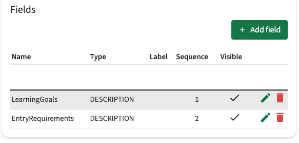
Add or modify fields shown in a Widget
Click on Add field to add or on the pencil to modify an existing field configuration.
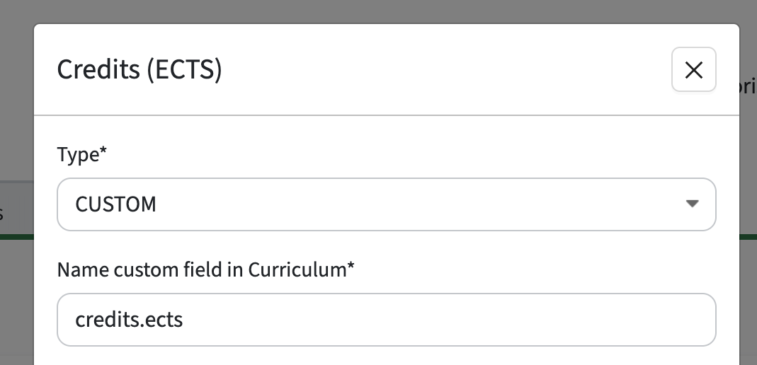
The example below shows the configuration for the field that shows the last review date of the module. This field is configured in Curriculum as an additional custom-field.

Options supported are:
- (Field) Type: the type that defines the field
- Name: the technical name, used for identification the configured field in Curriculum
- Sequence: the order of the tab in the header bar
- Filter: the optional filter configuration to only show this widget in case the configuration is met, e.g. type = MOOC to only show this widget if the module type = MOOC.
- Format: Option to configure the information to be shown in case a reference list is used as information source. Default the name of the value is shown, but using the format this can be altered using the verbs ${name} and ${code}. E.g configure to show both name and code, something like ${name} (${code}).
- Reference type: the option to specify the related object type to be shown, only used for field type Link (see below).
- Label: the (multi-lingual) text shown in the header of the widget
- Tooltip: additional information provided via a tooltip to the user
- Visibility: option to define if the field will be shown (never, always, only if there is a value) and an option for testing to limit visibility to the Admin only.
Supported field types
Different field types are supported and can be used to add fields and implicit define behaviour of the information shown to the user.
Supported types are:
- additional: used to show a value, that is configured as an additional custom-field in Curriculum
- assessments: used to show values that are defined on the assessment / appraisal objects in Curriculum
- custom: used to define a custom value
- description: used to show a descriptive text
- groups (module only): used to show the groups of al the module groups that offer the module.
- licenses: used to show the information on and values of the license object
- links: used to show the related educational objects, e.g. study from module, qualification/specification from study.
- methods: used to show the teaching methods
- objectives: the objectives defined and related to the module
- periods: used to show offering period information. In case a module is offered multiple times, the periods are shown comma separated.
- periods_value: used to show values that are defined on the periods
- relation: used to show the relations, configured by type (e.g. coordinator, lecturer, …)
- url: used to show a link to an external system
- value: used to show a value, that is considered a base information element configured in Curriculum, e.g. code
Specific configuration rules for field types
The configuration of the field types is rather straight-forward by just filling out the different requested fields.
There are some rules / considerations when configuring the different types concerning the usage of the Name value.
- additional: the name should be exactly the same as the Name used for the additional custom-field in Curriculum
- assessments: the name should be exactly the same as the Name used for the assessment/appraisal custom-field in Curriculum
- description: the name should be exactly the same as the Code used in Curriculum for a specific text (Element configuration in Curriculum)
- links: specify the type of the object that should be shown as links using the Reference type
- periods: the name should be periods
- periods_value: the name should be exactly the same as the Name used for the periods custom-field in Curriculum
- relation: the name should be exactly the same as the Code used in Curriculum for a specific role (Roles configuration in Curriculum)
- value: the name should be exactly the same as the Name used for the custom-field in Curriculum. For credits use the preset name credits.
Setting the right credits (custom-field) information
The default credits configuration in Curriculum provides the fields minimum, optimum and maximum. It is supported to hide these fields and / or add own defined custom-fields. These fields were not exchanged with study guide and couldn't therefor not be added/shown in study guide. This has been fixed, so the custom-fields defined for credits are correctly exchanged and available for display in the study guide.
Setting the period display type
The default display of periods is showing the period(s) using the defined abbreviation, separated by a comma in case multiple offering periods are defined. E.g., S1, S2.
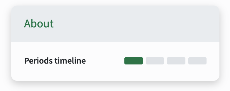
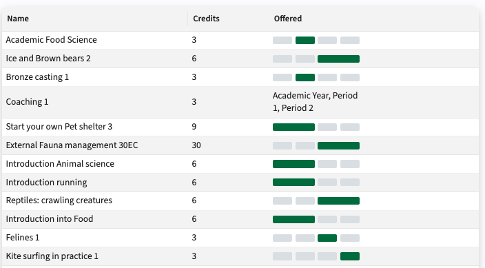
Next to the default a specific visualisation widget for offering periods named PERIODS_TIMELINE is available next to the PERIODS_VALUE (e.g. P1, S2), as shown below.
The period widget that is based on the PERIODS_TIMELINE can be used both in the detail pages and list pages.
It will default visualise the periods as shown above. In case multiple offering periods are defined and there is an overlapping period (e.g., S1 and Q2+Q3), the display will fall back for that specific module to the standard value representation (S1, Q2+Q3).
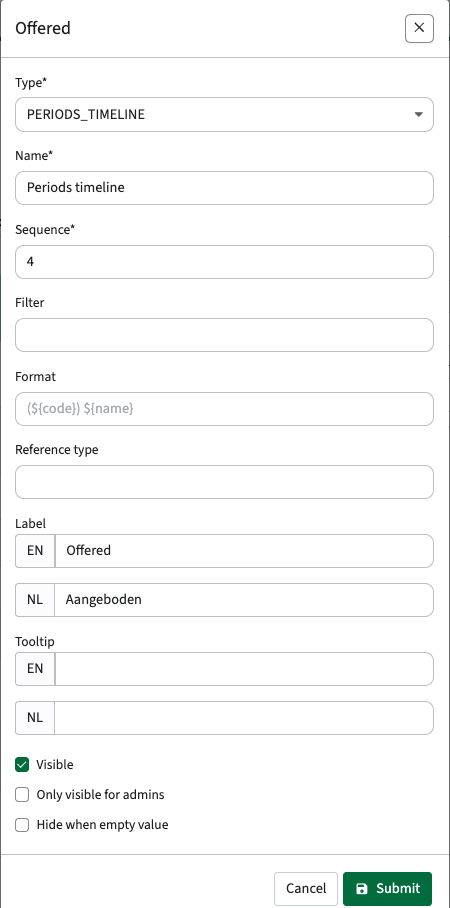
The configuration starts with the standard configuration of a new widget, and add a field based on the PERIODS_TIMELINE template.
In the example below the standard module-search-header is configured to show the module title, the credits and the periods as timeline visualisation.
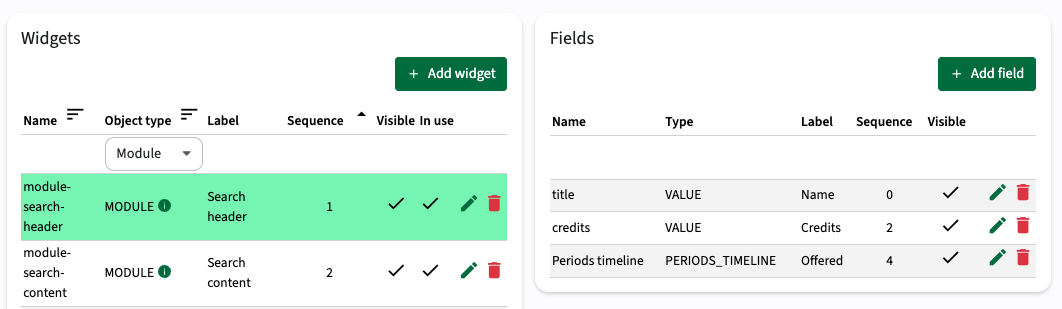
The configuration of the field credits is straight-forward. Just define the field credits is based on PERIODS_TIMELINE and the config is done.
The visualisation is added to the search result, which means the search result is as shown below. In this case we added a module with overlapping periods, to show that happens in that specific case.
Configure the content widget
The configuration of the general (content) area may consist of the definition of multiple different widget types.
The example below shows the configuration of the study detail page and shows two tabs that have been configured using the Tab config.
For each of this two tabs a specific widget must be defined.
This section will cover the configuration of the content widget offering the textual information.
The next sections will cover the definition of the structure and appraisal widget.

The actions to create and manipulate the buttons are similar to the other widgets and will not be repeated, just navigate back to the general widget configuration section.

The available texts for the selected object type are based on the Element (Reference) information on descriptions received from Curriculum.
Respective supported descriptive text Reference information is:
- FACULTY_DESCRIPTION
- SPECIFICATION_DESCRIPTION
- QUALIFICATION_DESCRIPTION
- STUDY_DESCRIPTION
- MODULEGROUP_DESCRIPTION
- MODULE_DESCRIPTION
Add a field for each of the desired descriptive text sections.

The Hide when empty value can be handy to prevent showing empty headers for text sections not having any content.
Configure the structure widget
The structure page providing the detailed overview of program structure, only the information (and headers) shown in the overview of modules can be configured.

The above configuration in the widget configuration is shown underneath.
The description is not shown, since none of these modules have a description and the config has the Hide when empty value set.

Note that in this specific situation fields of type CUSTOM are used. The reason is that in a structure information is partly based on the context and relation. E.g. module give in the context of a specific program can have a different offering period than when it's in another program.
The available CUSTOM type, where the name should exactly match to show the correct value are:
- offerings: will show the offering period(s) defined on the module->module-group relation
- phase: will show the phase defined on the module->module-group relation
- credits: will default show the defined optimum credits. This could also be configured as VALUE, since it is not defined on the relation, but on the module itself. The name credits should be used.
Configure the appraisals widget
The appraisal widget is of type Appraisals that will provide the visualisation of the assessments, weighting, minimal grade, etc. in a specific view.
The appraisal widget is in many aspects similar to the structure widget. It is used to define what 'information' should be shown in the appraisal scheme, similar to the module information in the structure view.
Use the default widget management options to add or manage a widget. The example configuration below shows that the appraisals widget has been enriched with two additional fields, the weighting and the code of the assessment.

Configure the learning goals widget
The learning goals widget is used to visualise the learning goals defined on the modules in Curriculum.
The configuration is extremely simple, since it will only need one field to be configured to show a bullet list of all learning objectives.

Just like all other widgets the label is used to configure the Title above the widget.
The tooltip can for this specific widget type be used to specify an introduction to the bullet list, e.g. At the end of the module, the student has learned.
Configure the buttons widget
The button widget is used to configure the buttons shown in the button section.
Links can not only defined using buttons, but can also be added as fields to the general widget using the field type URL.
The actions to create and manipulate the buttons are similar to the other widgets and will not be repeated, just navigate back to the general widget configuration section.

To configure a button, define the Type (URL) and the the link. Supported fields that will be substituted by the (module) information of the selected module, study, faculty, ..., are:
- {code} - the module, study or module group code
- {id} - the technical (external Id) of the module, study or module group


Configure the curriculum mapping widget
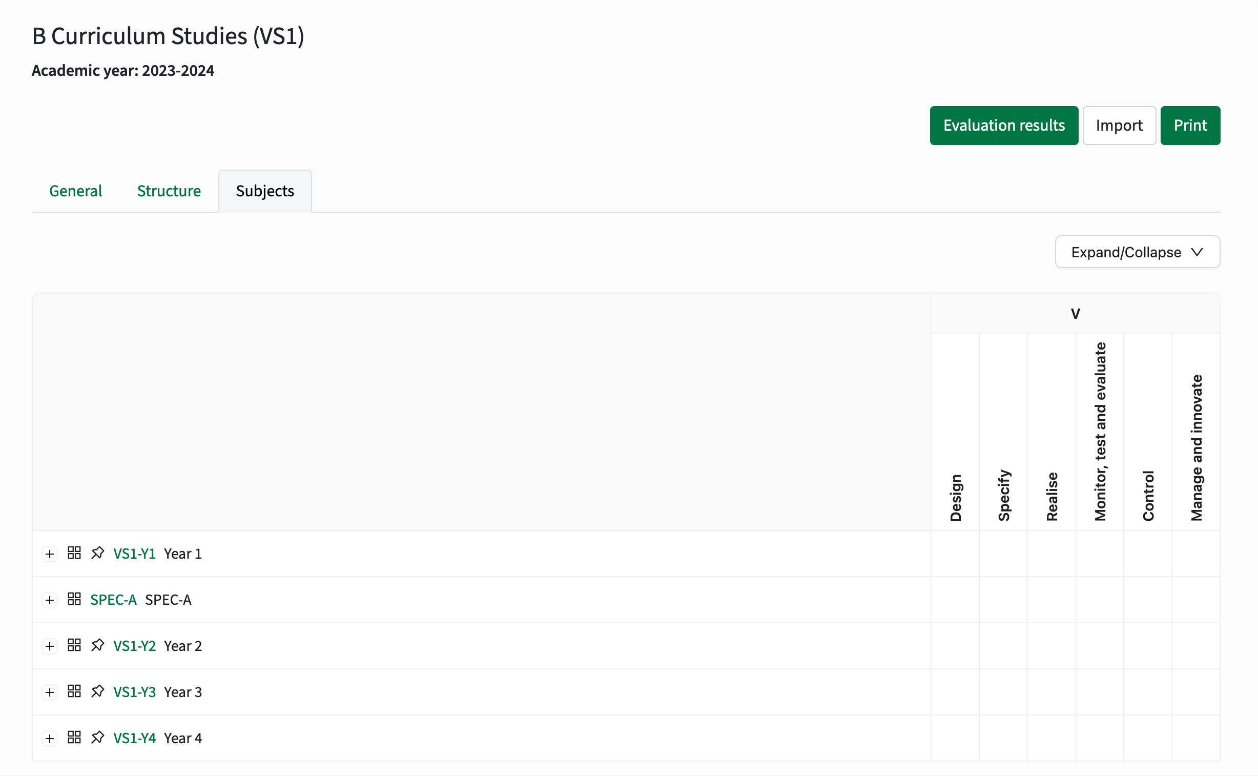
Curriculum mapping has been added to Curriculum and extended the last year. Some curriculum mapping data has been made available in Study guide at module level in the last year too. This year we kick-off of with the first iteration of a matrix-report widget that provides insight in the subjects (learning outcomes, skills, ...) that will be the outcome of the study and the contribution of the modules in the study to the different subjects and objectives (learning goals).
The image below shows a configured example of the curriculum mapping matrix report for a study in the study guide. The matrix-report is available to show the curriculum mapping information both for the Study object and the Module-group object.
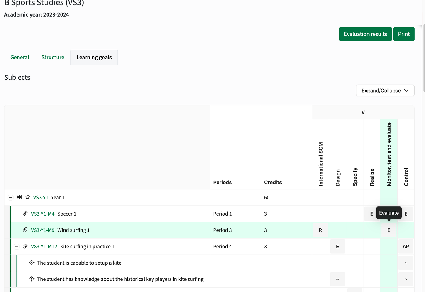
As might be noticed, the category grouping as defined in curriculum (top of the image) is shown as code and not as the label. This is a known issue, but requires an API change that wasn't feasible to be done in this release.
Configuration
The configuration consists of different steps from definition of the basic configuration to enabling the widget to be shown in the study guide.
1 - Configure the widget
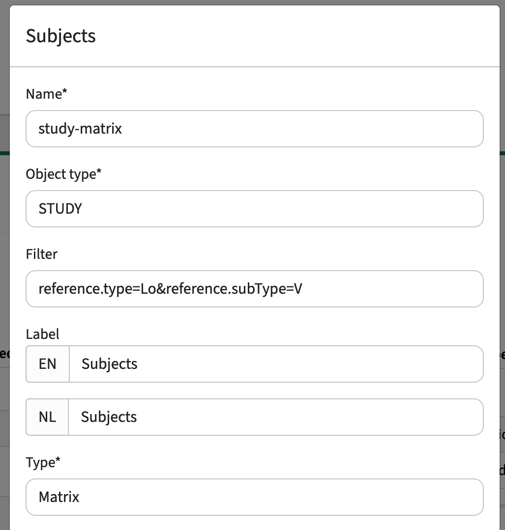
Configure a new widget of type Matrix.
A filter can be applied to limit the visualisation of the subjects to a specific category, e.g. reference.type=Lo&reference.subType=V. This filter shows only subjects with subject type Lo and subject category V.
The setup of the filter requires knowledge of the configuration in Curriculum and the used subject categories and types.
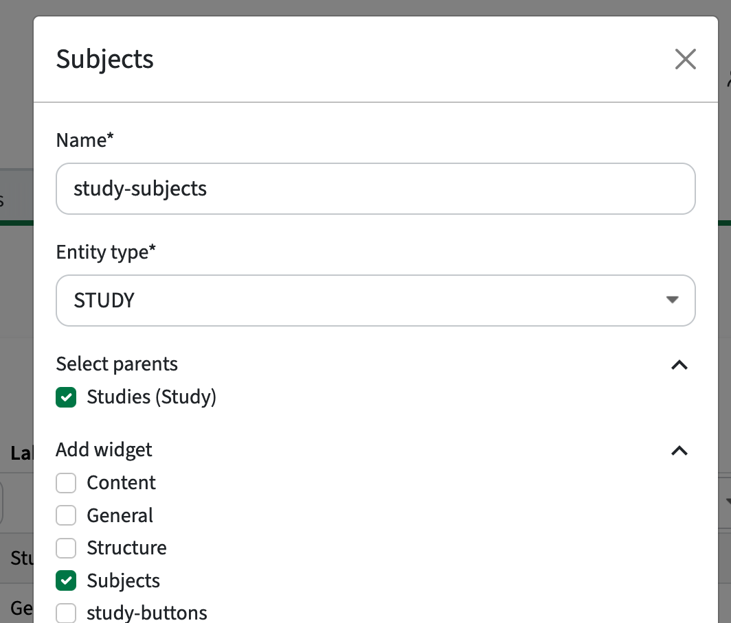
2 - Add the widget to the tab
The widget is designed (and usable) as a separate tab, just like the structure tab. This means that the visualisation of the curriculum mapping widget is performed by adding it as a new tab. This is done by adding the widget as a tab to the relevant parent(s).
3 - Validate the configuration
The tab should be added and by selecting for instance a study the tab (Subjects) should be available and show the study curriculum mapping widget.